A couple of years ago, I blogged about the new visual identity of my then business school, ESSCA. Time has passed, I have moved on, here’s a post about my current institution’s visual identity change. On January 12th, the Université Paris 1 Panthéon Sorbonne has indeed “changed” its visual identity (actually “updated” or “harmonized,” – we are far away from the MIT Media Lab for instance), unveiling a new visual identity designed by the designer Gérard Caron. The new logo is now organized around two strong visual elements that constitute the institution’s heritage: the front of the Pantheon and the dome of the Sorbonne chapel.
If you like, you can watch the video that introduces the new logo, a very simple short animation:
–
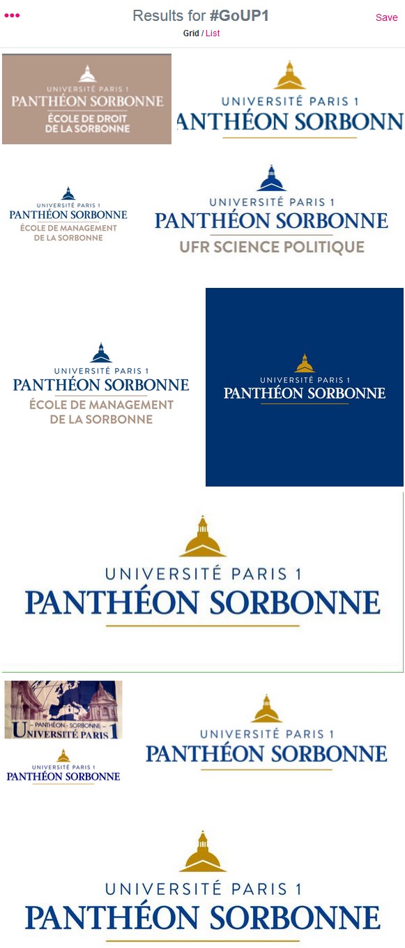
Scroll down the following image, which is basically a screenshot of the Twitter’s image search for #GoUP1, the hashtag that the university has launched for the new year and the logo change:

You see how the identity is rolled out for various departments, disciplines and schools within the university. On the bottom left, you can see a before/after image.
Below is another photo, tweeted by the university, showing Gérard Caron explaining the rationale behind the new brand identity. This photo was taken and shared during the 2015 new years wishes hosted by university president Philippe Boutry:
–
By creating and rolling out this new identity, the university wants to have a strong and coherent brand image that uses the internationally recognized “Sorbonne” name, while also allowing to reflect the diversity of disciplines that are being taught at Université Paris 1 Panthéon Sorbonne. “The quality of our teaching and the excellence of our research are essential to the reputation and the positioning of the university, especially for rankings, but having an ambitious and coherent way of communicating allows us to be known for it” said Nadia Jacoby, vice president of the university in charge of communication, in the press release.
What think?
